Open post Blue signal pulse spiking across a horizontal threshold line on a black and white split background, visualizing system response time

The Doherty Threshold

DOHERTY THRESHOLD IN USER EXPERIENCE DESIGN
Designing for user experience often comes down to how fast things feel. Even the most beautiful interface can frustrate if it leaves users waiting too long. That’s where the Doherty Threshold comes in—a principle that highlights how crucial speed and feedback are in shaping human–computer interaction.

THE CORE IDEA
First described in a 1982 IBM study, the Doherty Threshold shows that productivity increases dramatically when systems respond in less than 400 milliseconds. At this speed, users and computers stay in sync—neither one waiting on the other. Beyond this threshold, frustration builds, attention drifts, and performance drops.

In practice, that means:

  1. Immediate feedback: acknowledge user input instantly, even if more processing is required.
  2. Perceived speed: design responses that feel fast, even if they aren’t.
  3. Trust through pacing: purposeful micro-delays can sometimes build confidence that something meaningful is happening in the background.

Simply put: respond within 400 ms, and you keep people engaged and productive.


DESIGN IMPLEMENTATION STRATEGY

  1. Feedback Loops: Even when operations take longer, showing visible acknowledgment prevents users from feeling ignored.
  2. Perception Management: Skeleton screens, animations, and progress bars create the sense of responsiveness, reducing the pain of waiting.
  3. Meaningful Delays: Adding slight pauses can increase the perceived value of a process—suggesting thoroughness, security, or importance.

CONTEMPORARY APPLICATIONS

  • Skeleton Screens: Platforms like Facebook use placeholders that suggest content is on its way, reducing the feeling of waiting.
  • Blur-Up Images: Medium first shows a blurred, low-res image that sharpens as the real one loads, creating smoothness and speed.
  • Progress Indicators: Gmail’s animated loading bar reassures people that the system is active.
  • Optimistic UI: Instagram shows comments as posted instantly, even before the backend confirms them, improving perceived performance.

DESIGN RESILIENCE CONSIDERATIONS
Attention Span: Once wait times exceed 10 seconds, users naturally shift focus. Progress bars with time estimates help them manage expectations.
Transparency: Communicating what’s happening in the background reduces frustration.
Consistency: Systems should strive to stay under the 400 ms threshold, but when they can’t, perception-focused design keeps engagement high.

STRATEGIC INSIGHTS

¬ Respond quickly: Even minimal feedback prevents frustration.
¬ Design for perception: Use animations and placeholders to make waits feel shorter.
¬ Build trust with transparency: Time estimates and status updates reassure users.
¬ Plan for drift: Beyond 10 seconds, guide attention with information and context.
¬ Respect the threshold: Keep interactions under 400 ms wherever possible.


FINAL THOUGHTS The Doherty Threshold teaches us that performance is more than speed—it’s about how speed feels. By keeping responses under 400 ms and designing for perceived responsiveness, we not only maintain user attention but also create smoother, more enjoyable experiences. In a world where every millisecond counts, this threshold is the difference between frustration and flow.

Open post Mirrored waveform with blue peaks above and black peaks below a horizontal dividing line, representing the balance of liberal input and conservative output

Postel’s Law

POSTEL'S LAW IN USER EXPERIENCE DESIGN
Designing for user experience is rarely about a single “right way” of doing things. People bring all kinds of behaviors, preferences, and devices into the mix—and technology itself is always changing. That’s where Postel’s Law comes in. Originally coined by internet pioneer Jon Postel for network protocols, this principle has since become a guiding light for building interfaces that are both reliable and flexible enough to handle real-world diversity.

THE CORE IDEA
Postel’s Law, sometimes called the Robustness Principle, can be summed up in one deceptively simple line: "Be conservative in what you send, be liberal in what you accept."

In practice, that means:
• Conservative outputs: systems should be dependable, predictable, and accessible.
• Liberal inputs: they should be forgiving, able to handle different formats, unexpected user behavior, and alternative interaction methods without breaking.

This balance—tight control on what you deliver, broad tolerance for what you receive—is what makes digital experiences feel smooth and human-friendly.

DESIGN IMPLEMENTATION STRATEGY
Reliable Outputs: Interfaces should work consistently no matter the device, screen size, connection speed, or input method. That stability gives users confidence that your product will “just work.”

Flexible Inputs: People interact in countless ways—typing, swiping, speaking, or using assistive technology. A system that gracefully handles all of these variations makes users feel supported rather than punished for doing things differently.

CONTEMPORARY APPLICATIONS
Responsive Web Design: Think of how websites adapt from a smartwatch to a desktop monitor. The structure flexes, but the experience remains intact.
Progressive Enhancement: At the base level, everyone gets access to the essentials. Those with newer or more capable devices enjoy added features, but no one is left out.
Authentication Systems: Biometric login, like facial recognition, shows how systems can accept new forms of input while still enforcing security.

DESIGN RESILIENCE CONSIDERATIONS
Internationalization: A sentence in English might balloon in size when translated into German or Russian. Good layouts plan for that from the start.
Accessibility: Adjustable font sizes, custom contrast modes, and assistive tech shouldn’t break your design. They should feel naturally supported.
Design Systems: Shared design frameworks help large teams manage variability in inputs while producing outputs that remain consistent and reliable.

STRATEGIC INSIGHTS

¬ Lead with empathy: Expect users to do things in unexpected ways—and design for that.
¬ Plan for variety: Think beyond your own device, language, or context.
¬ Translate inputs gracefully: Accept messy user input and turn it into something structured and useful.
¬ Aim for universal accessibility: Your product should work across the widest range of devices and abilities.
¬ Stay adaptable: Technology evolves. Your design should bend with it, not break.


FINAL THOUGHTS
Postel’s Law isn’t just a relic from the early internet—it’s a philosophy that still matters deeply today. When you design systems that are strict in what they output but generous in what they accept, you create products that feel both reliable and human. It’s a mindset that leads to inclusive, adaptable experiences—ones that keep working no matter who shows up or how they interact.

Open post Branching decision tree with a blue central trunk and black branches ending in nodes, illustrating how choices multiply decision time

Hick’s Law

THE POWER OF CHOICE IN USER EXPERIENCE DESIGN
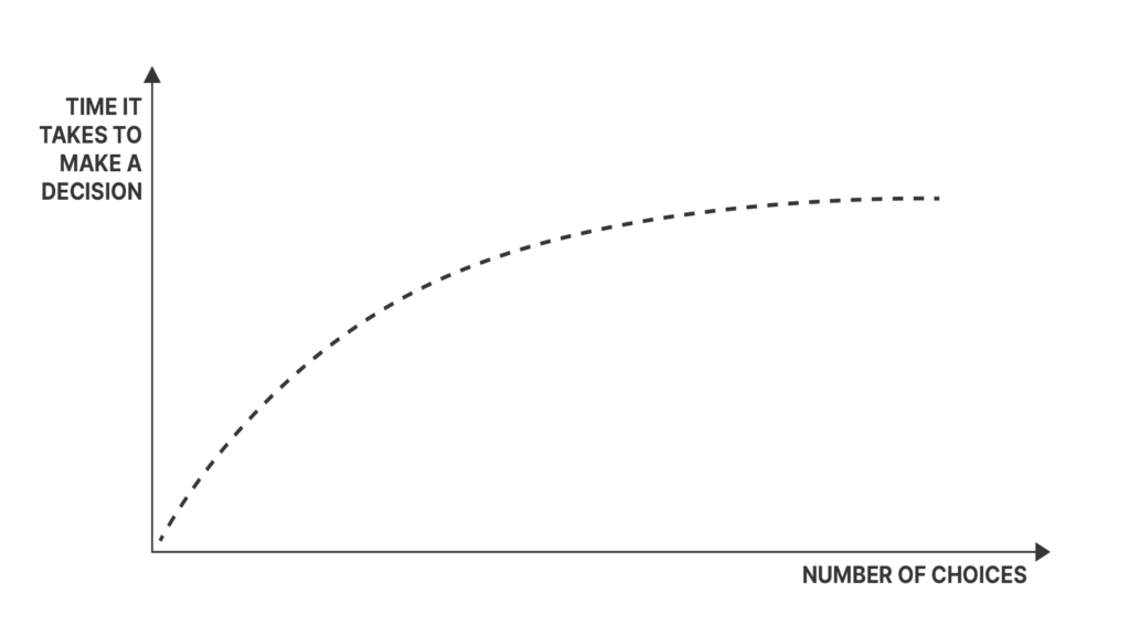
Contemporary User Experience (UX) design requires understanding how users make decisions. Hick's Law, developed by British psychologist William Edmund Hick, demonstrates that more choices lead to longer decision times. This principle provides essential guidance for creating efficient user interfaces that reduce cognitive load and improve user satisfaction.

THEORETICAL FOUNDATION
Hick's Law originated from systematic studies conducted during the 1950s by William Hick and Ray Hyman, investigating the relationship between stimulus quantity and cognitive response time. Their research established a fundamental principle: decision-making duration increases proportionally with the number of available choices.

The research yielded a quantifiable relationship demonstrating that choice proliferation correlates with extended decision-making periods, following a logarithmic progression. This principle is mathematically expressed as:

RT = a + b log2 (n)

  • RT represents total reaction time
  • a & b constitute task-specific and environmental constants
  • n indicates the total number of available choices


This formula demonstrates profound implications for interface design when integrated with cognitive load theory.

COGNITIVE LOAD INTEGRATION
Cognitive load quantifies the mental processing capacity required for task completion or information processing. When combined with Hick's Law principles, it reveals that choice multiplication impacts both temporal efficiency and cognitive resource allocation. Each decision point represents a processing task requiring dedicated mental resources, creating cumulative cognitive demands.

Strategic Application Example: Restaurant menu design illustrates this principle effectively. A five-item menu facilitates rapid decision-making, while a fifty-item menu extends selection time significantly. Beyond temporal considerations, the expanded menu increases cognitive load through taste preference evaluation, experiential recall, nutritional assessment, and comparative analysis processes.

UX DESIGN IMPLICATIONS
Within UX frameworks, Hick's Law functions as a strategic guideline against user choice overload. Excessive options generate elevated cognitive demands, resulting in extended decision periods, decision paralysis, or complete task abandonment.

STRATEGIC IMPLEMENTATION GUIDELINES

¬ Choice Optimization: Minimize available options when rapid user responses are critical for maintaining engagement and conversion rates.
¬ Task Segmentation: Decompose complex processes into sequential, manageable components to reduce cognitive burden and improve completion rates.
¬ Recommendation Systems: Implement strategic choice highlighting to prevent decision fatigue while maintaining user autonomy.
¬ Progressive Disclosure: Deploy incremental feature introduction to minimize initial cognitive demands during user onboarding processes.
¬ Design Balance: Maintain interface simplicity while preserving functional clarity and avoiding excessive reduction that creates ambiguity.

EXECUTIVE SUMMARY
Hick's Law, supported by decades of psychological research, provides essential insights into choice impact on decision efficiency. When integrated with cognitive load principles, it reveals comprehensive psychological implications of design choices. These combined frameworks enable the development of user-centric interfaces that optimize cognitive efficiency while maintaining functional effectiveness. Strategic application of these principles ensures sustainable user engagement through scientifically-informed design decisions that balance choice availability with cognitive accessibility.

Open post Illustration of the hierarchy of needs concept applied to design

The “Hierarchy of Needs” concept

HIERARCHY OF NEEDS IN PRODUCT DESIGN
Contemporary product and user experience design requires systematic understanding of user requirements across multiple engagement levels. Strategic design success depends upon comprehensive need fulfillment that extends beyond aesthetic considerations to encompass functional, psychological, and aspirational user dimensions. The Hierarchy of Needs framework provides a structured methodology for achieving sustainable competitive advantage through progressive user value creation.

FOUNDATIONAL DESIGN PRINCIPLES

  1. FUNCTIONALITY: Core Value Proposition
    Fundamental product utility constitutes the essential foundation for all subsequent design considerations. Products must deliver primary functional requirements effectively to establish market viability. Functional inadequacy renders aesthetic and usability enhancements irrelevant, creating immediate user abandonment and market failure.
  2. RELIABILITY: Trust Establishment
    Consistent performance across usage scenarios builds essential user confidence and long-term engagement. Reliability encompasses system stability, security protocols, and predictable functionality. Digital products require crash-resistant architecture, secure transaction processing, and consistent load performance to maintain user trust.
  3. USABILITY: Interaction Optimization
    Intuitive interaction design transforms functional products into accessible solutions. Usability excellence reduces cognitive load, minimizes learning curves, and facilitates efficient task completion. Strategic usability implementation converts casual users into committed advocates through friction reduction and satisfaction enhancement.
  4. PROFICIENCY: Capability Enhancement
    Advanced functionality that amplifies user productivity and professional capabilities generates significant competitive differentiation. This level establishes user pride and status association through enhanced performance outcomes. Professional tools and productivity features exemplify proficiency-level design implementation.
  5. CREATIVITY: Innovation Leadership
    Peak-level design fosters continuous innovation and personal growth opportunities, creating profound user loyalty and brand advocacy. Products achieving creativity-level engagement become integral to user identity and lifestyle, establishing sustainable competitive moats through emotional investment.

STRATEGIC APPLICATION: CASE ANALYSIS

Apple iPhone Implementation Framework:

  1. FUNCTIONALITY:
    Integrated communication, entertainment, and internet access within a unified device architecture, establishing comprehensive utility across multiple use cases.
  2. RELIABILITY:
    Systematic software updates and hardware-software integration ensured consistent performance and long-term device dependability.
  3. USABILITY:
    Revolutionary touch interface with intuitive gesture controls established new industry standards for smartphone interaction design.
  4. PROFICIENCY:
    App Store ecosystem and intelligent assistant integration transformed the device into a comprehensive productivity platform.
  5. CREATIVITY:
    Continuous innovation cycles and ecosystem integration fostered deep brand loyalty and cultural significance, establishing the iPhone as a lifestyle identifier.

COMPETITIVE STRATEGY IMPLICATIONS
Strategic design planning utilizing hierarchical need fulfillment creates substantial competitive advantages. Products addressing only foundational levels remain vulnerable to market disruption, while those achieving proficiency and creativity levels establish defensible market positions through enhanced user investment and switching costs.

EXECUTIVE SUMMARY
The Hierarchy of Needs framework provides essential strategic guidance for systematic product design development. Progressive need fulfillment—from functional adequacy through creative innovation—enables the creation of transformative user experiences that exceed expectations and establish market leadership. Design professionals must systematically address each hierarchical level to achieve sustainable competitive advantage and meaningful user engagement. Strategic implementation of this framework transforms functional products into indispensable user solutions that drive long-term business success through deep user loyalty and market differentiation.

Open post Visual representation of horror vacui — the fear of empty space in design

HORROR VACUI

UNPACKING HORROR VACUI
Design always involves a choice between simplicity and complexity, and that choice shapes how people see a brand and interact with it. Horror Vacui—the tendency to avoid empty space—plays a key role in this process. It’s a design principle that not only affects how things look but also how consumers respond to them. Knowing how it works allows designers to make smarter decisions about space and layout in modern practice.

THEORETICAL FOUNDATION
Horror Vacui, Latin for “fear of emptiness,” has its roots in classical philosophy, with Aristotle among the early voices exploring ideas of space. In design today, it shows up as a method of filling every available area with visual content. This creates a sharp contrast with minimalism, leading to very different aesthetic styles and psychological effects.

CONTEMPORARY APPLICATIONS
You can see Horror Vacui in action across many forms of media—print newspapers, comic books, and digital interfaces, to name a few. In each case, the strategy is to pack in as much information and visual content as possible, aiming to hold attention through density and richness.

VALUE PERCEPTION CORRELATION
Studies show that the more intense the use of Horror Vacui, the lower the perceived value of the product or brand. Retail displays make this easy to spot: crowded shelves and busy layouts are often tied to budget or mid-market brands, while minimalist designs usually signal high-end or luxury positioning.

IMPLEMENTATION RISKS

  1. Message Dilution: Too many elements compete with one another, making it harder for the main message to stand out or stick in memory.
  2. Readability Issues: Overcrowded layouts can make text harder to read and navigation more frustrating, especially online.
  3. Decision Paralysis: When users face too much information at once, they may feel overwhelmed and either delay decisions or disengage altogether.
  4. Brand Devaluation: Clutter often signals lower quality, weakening brand prestige.

LUXURY MARKET DIFFERENTIATION
Luxury brands almost always lean toward minimalism. Clean layouts and generous use of space suggest refinement and exclusivity. By contrast, Horror Vacui is more commonly found in mass-market contexts, where it communicates accessibility and affordability rather than luxury.

STRATEGIC INSIGHTS

¬ Historical Precedent: Horror Vacui isn’t new—it’s grounded in long-standing philosophical ideas rather than being a recent design fad.
¬ Cross-Platform Presence: It shows up in both print and digital design, proving its wide range of applications.
¬ Brand Positioning Impact: How heavily Horror Vacui is used can directly affect consumer perceptions of value and brand rank.
¬ Market Segmentation: Minimalism dominates in the luxury segment, while Horror Vacui is more common in mainstream markets.
¬ Strategic Implementation: To use Horror Vacui effectively, designers must plan carefully and understand how their audience interprets visual density.


EXECUTIVE SUMMARY
Horror Vacui is a core design principle that shapes both brand identity and consumer response. While it allows for rich content and visual intensity, it must be applied with care. The key is balance: using space thoughtfully while keeping messages clear. Designers who apply Horror Vacui with intention—aligned with brand goals and audience expectations—can harness its impact without sacrificing clarity or value.

Open post Illustration of figure-ground theory applied to architectural design

Figure-Ground Theory in Architecture

UNDERSTANDING THE FIGURE-GROUND THEORY IN ARCHITECTURE
The relationship between buildings, structures, and their surrounding open spaces isn’t just about looks—it’s rooted in a fundamental concept called "figure-ground theory." This principle from design and architecture helps us understand how spaces are perceived and used.

WHAT IS THE FIGURE-GROUND THEORY?
At its core, the figure-ground theory comes from Gestalt psychology, which focuses on how we perceive the world. Essentially, it describes our ability to visually separate an object ('figure') from its background ('ground'). Think of how you instantly recognize a subject in front of a background—this is figure-ground perception at work.

** [The Gestalt theory of perception proposes that people make sense of the world by combining distinct elements into unified wholes.]

HOW DOES IT APPLY TO ARCHITECTURE?
In architecture and urban planning, this theory helps us understand how buildings relate to open spaces like streets, plazas, or gardens. A common tool is the "figure-ground diagram"—a black-and-white map where solid shapes represent buildings (figures) against white open space (ground). This contrast highlights patterns in urban density, connectivity, and spatial flow.

WHY IS IT IMPORTANT?

  1. Spatial Clarity: The theory helps architects create spaces that are easier to navigate by clarifying the relationship between buildings and open areas.
  2. Urban Connectivity: In urban planning, large white (open) areas on a figure-ground diagram indicate better walkability and connectivity.
  3. Aesthetic Balance: A balanced mix of built forms and open space creates harmonious environments where neither element overpowers the other.
  4. Functional Efficiency: By analyzing these relationships, architects can optimize circulation and functionality in buildings and urban spaces.

A MODERN TAKE ON FIGURE-GROUND
While traditional figure-ground diagrams are black and white, modern versions use gradients or colors to represent different building heights or uses. These detailed diagrams reveal deeper insights—like how skyscrapers might overshadow public spaces or how a park can stand out in a dense urban area.

IN CONCLUSION
The figure-ground theory isn’t just architectural jargon—it’s a powerful tool for understanding the spaces around us. Whether it’s city planning, park design, or building layout, this relationship between 'figure' and 'ground' shapes how we experience environments daily. When elements are implied (present but not distinctly visible), they still influence perception. By thoughtfully balancing built forms with open space, architects can create more meaningful and functional designs.

Open post Illustration representing the IKEA effect in product design

The IKEA effect

THE IMPORTANCE OF THE IKEA EFFECT IN PRODUCT DESIGN
In product design—whether physical or digital—the way users interact with products shapes their perception and value. One fascinating psychological principle that plays a key role here is the IKEA effect. This concept has significant implications for both tangible and digital products, making it essential for designers to understand.

DEFINING THE IKEA EFFECT:
The IKEA effect refers to how users assign greater value to products they’ve helped create or customize. Originating from IKEA’s DIY furniture model, this principle applies not just to physical products but also to digital experiences where personalization enhances perceived worth.

CASE STUDIES

¬ IKEA Furniture: The classic example. Assembling your own furniture creates a sense of accomplishment and deepens emotional attachment.
¬ Customizable Sneakers: Brands like Nike and Adidas let customers design their own shoes, choosing colors, materials, and even personal engravings. These customized sneakers hold unique value beyond mass-produced alternatives.
¬ Player-Created Avatars in RPGs: In games like *The Elder Scrolls* or *World of Warcraft*, players design characters’ appearances, skills, and backstories. This deep customization strengthens their connection to the game world.
¬ Custom UI/UX Configurations: Many software solutions allow users to personalize interfaces, which can boost loyalty and engagement.

KEY INSIGHTS:

  1. Ownership and Value: Whether assembling furniture or customizing a dashboard, the act of creation increases emotional investment.
  2. Beyond Functionality: The IKEA effect shows that value isn’t just about utility—the process of personalization itself holds meaning.
  3. Engagement Spectrum: Products leveraging this effect often see higher engagement, turning passive users into active participants.

POTENTIAL CHALLENGES:

¬ Complexity: Customization can overwhelm users if not carefully balanced—finding the right level of control is key.
¬ Accessibility: Some users thrive in DIY environments, while others may find it frustrating. Designing for a broad audience is essential.
¬ Resource Allocation: Especially in software, personalization requires significant effort. Ensuring it aligns with user needs and business goals is critical.

CONCLUSION:
The IKEA effect isn’t just a psychological quirk—it’s a powerful tool for shaping product-user relationships. For designers, architects, and strategists, understanding this principle can lead to more meaningful, user-centric experiences. Whether you’re designing furniture or digital solutions, leveraging the IKEA effect can set your products apart.

Open post Illustration of anthropomorphic design elements in products

Anthropomorphism in Product Design

ANTHROPOMORPHISM IN PRODUCT DESIGN
Anthropomorphism represents the strategic application of human characteristics to non-human entities within product design frameworks. This design methodology leverages fundamental psychological principles to enhance user engagement, facilitate intuitive interactions, and establish meaningful product relationships. For design professionals, understanding and implementing anthropomorphic principles constitutes a critical competency in contemporary product development.

STRATEGIC SIGNIFICANCE IN DESIGN

  1. Emotional Connection: Human psychological predisposition toward social bonding extends to products exhibiting human-like characteristics. This connection mechanism drives brand loyalty and sustained user engagement through emotional attachment rather than purely functional considerations.
  2. Intuitive Usability: Products incorporating familiar human gestures or expressions reduce cognitive load during user interaction. This design approach minimizes learning curves and enhances user adoption rates across diverse demographic segments.
  3. Trust Establishment: Anthropomorphic design elements facilitate trust formation, particularly crucial for emerging technologies or complex systems requiring user confidence and acceptance.

INDUSTRY APPLICATIONS

¬ Automotive Design: Vehicle front-end configurations systematically incorporate facial characteristics through headlight positioning and grille design. This approach generates emotional affinity and brand differentiation in competitive markets.
¬ Voice Interface Systems: Digital assistants employ personality-driven responses, vocal characteristics, and contextual understanding to humanize technological interactions and increase user comfort levels.
¬ Software Interface Design: Anthropomorphic avatars and interface elements facilitate user guidance and system navigation, exemplified by historical implementations such as Microsoft's Clippy assistant.
¬ Brand Identity Systems: Corporate mascots leverage anthropomorphic principles to establish memorable brand connections and enhance market recognition across consumer segments.
¬ Consumer Appliances: Traditional product categories, including teapots and kitchen appliances, incorporate facial characteristics through strategic component positioning and form language.

IMPLEMENTATION RISKS

¬ Expectation Misalignment: Excessive humanization may generate unrealistic user expectations regarding product capabilities, resulting in user dissatisfaction when technological limitations become apparent.
¬ Cultural Interpretation Variance: Anthropomorphic design elements may not translate effectively across global markets, potentially creating negative user perceptions or cultural misalignment in international product launches.
¬ Functional Compromise: Prioritizing anthropomorphic aesthetics over core functionality can diminish product performance and user satisfaction, particularly when design elements interfere with primary use cases.

STRATEGIC INSIGHTS

  1. Psychological Affinity: Users demonstrate measurable preference for products exhibiting human-like characteristics, driven by fundamental social cognition patterns.
  2. Emotional Processing: Anthropomorphic designs engage emotional evaluation pathways, reducing analytical scrutiny during purchase decisions and increasing acceptance rates.
  3. Analytical Versus Emotional Assessment: Non-anthropomorphic designs undergo more rigorous logical evaluation, requiring stronger functional justification for user acceptance.
  4. Form Language Strategy: Curved geometries communicate femininity and approachability; rounded forms suggest innocence and accessibility; angular configurations convey strength and authority.
  5. Engagement Optimization: Strategic implementation of human-like attributes significantly enhances user interest and emotional investment in product relationships.

Effective product design requires comprehensive understanding of user psychology and behavioral patterns. Anthropomorphism provides a powerful methodology for enhancing user experience when applied with strategic precision and cultural sensitivity.

EXECUTIVE SUMMARY
Anthropomorphism in product design represents a strategic methodology for enhancing user engagement through psychological connection mechanisms. While this approach offers significant advantages in user adoption, emotional bonding, and intuitive interaction design, implementation requires careful consideration of cultural contexts, functional requirements, and user expectation management. Design professionals must balance anthropomorphic elements with core product functionality to achieve optimal user experience outcomes. Strategic application of these principles can differentiate products in competitive markets while establishing sustainable user relationships through emotional design connections.

Scroll to top